
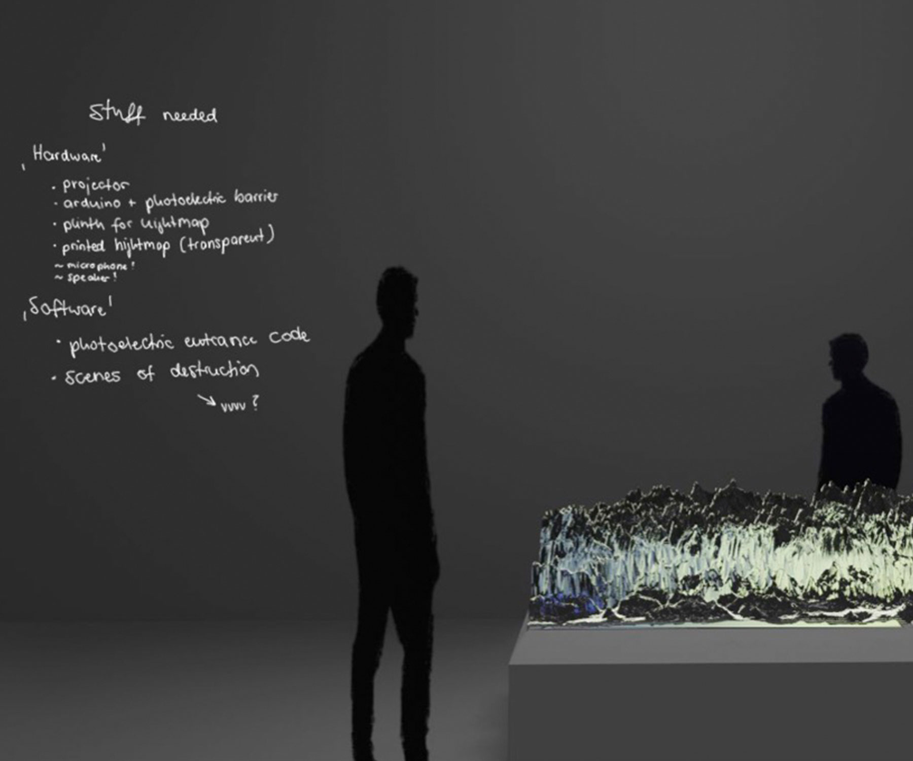
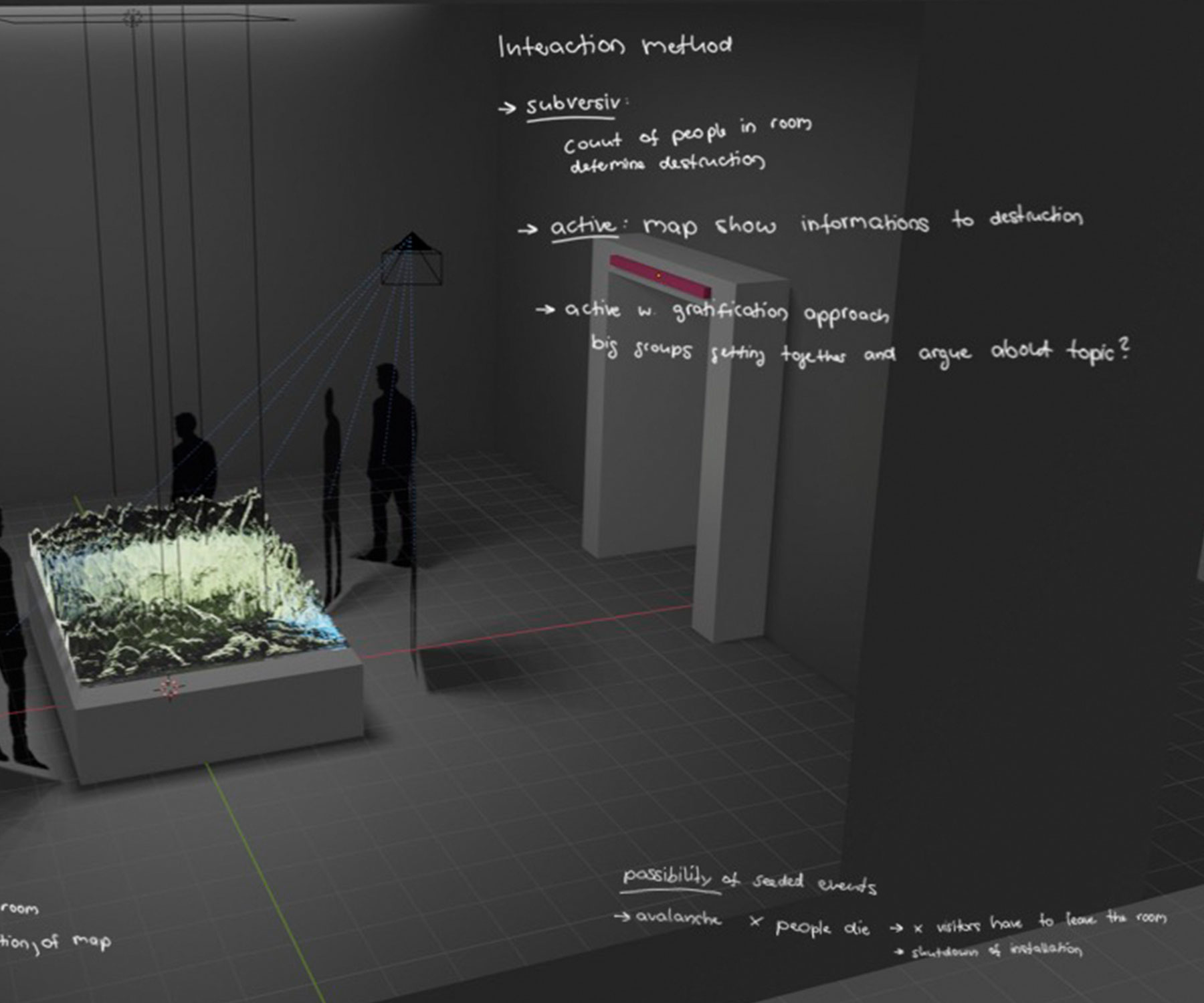
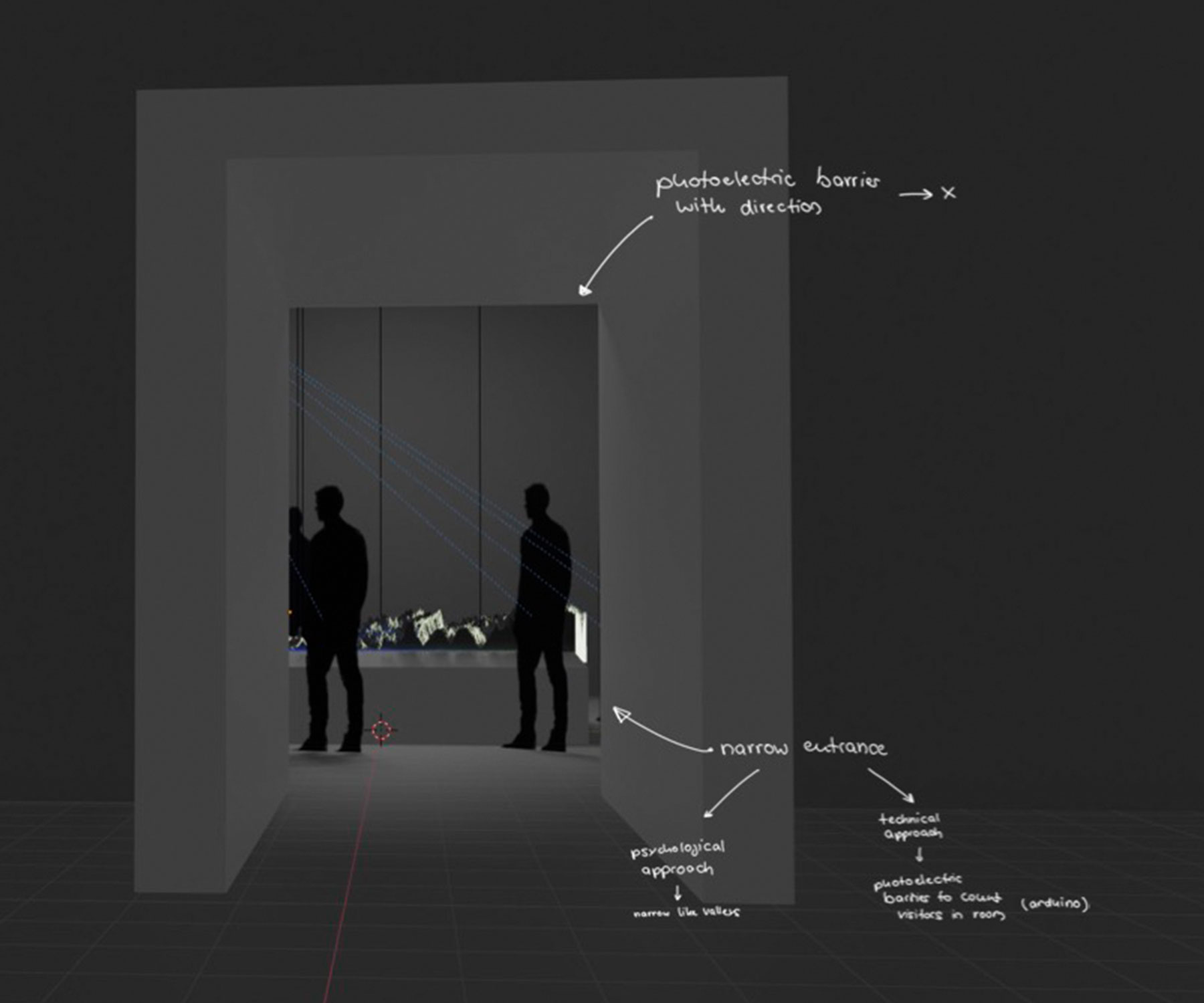
people.map
The alpine region is one of the biggest tourist hotspots in the world. But due to rising ecotourism, it is getting harder and harder to balance economic profitability and environmental protection. People.map visualizes the environmental effects of mass tourism interactively by using live data from a mobile light barrier. The project is designed as a map, that first measures the amount of people entering a certain area and then shows the environmental consequences in real-time on a dedicated webpage.
The whole project was designed as a group work within my master-graduation at the University of Applied Science Salzburg. Within the group, my task was building out the tech behind the whole system – mainly an off-grid-capable light barrier, which could stream in real-time datasets to an online database. Furthermore creating a simple webpage, which in the end serves as our visualization platform and holds different, open-source elements of the whole project.

